
Rebranding and redesign of Voyager, Best Pet Supplies’ flagship brand. I formalized UX/UI principles for our Amazon storefront and Shopify website based on research into our target market and customers. Designed and implemented an updated Shopify site, updated designs, and branding on our best-selling Amazon storefront, and worked with an external agency to create marketing strategies and campaigns to drive traffic. In addition to digital brand unification, I also rebranded physical assets, including packaging, product booklets, tags, and more.
-
◘ Creative Direction
◔ User Research
⇝ Product Strategy
❏ UI Design
▥ Prototyping
◘ Graphic Design
☺ User Research
-
◖ Figma
◖ Shopify
◖ Amazon
◖ Adobe illustrator
◖ Adobe photoshop
◖ Slack
-
▮ 7 weeks
Case Study
Case Study
Helping users have a better experience while purchasing online.
About the project
The problem
Voyager was struggling with stagnant sales growth and poor customer experience. The existing customers chose the brand based on price and reviews, but the company struggled to attract new customers. The website's user experience was also hindering sales, leading to a spike in returned products and a decline in customer satisfaction.
The Solution
To address these challenges, I research the target market and customers to understand their needs and pain points. Based on this research, we created a market segmentation and tailored the company's marketing efforts to reach the ideal customer.
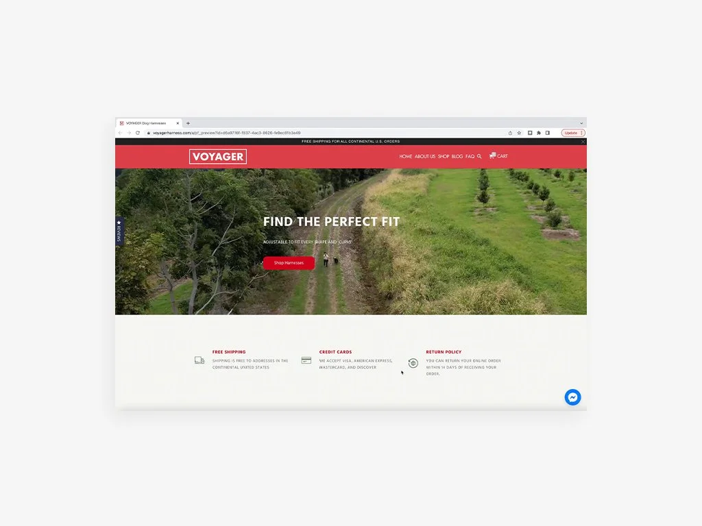
I optimized the customer journey to improve retention and enhance the conversion rate. The website was redesigned to be more accessible, making it easier for customers to find the right size harness for their dogs. The website's redesign also improved the overall customer experience, leading to a decline in returned products and increased customer satisfaction.
Business & User frustrations
Based on the research, we found our target market consisted of two different generations, Generation X and millennials. But we weren't talking to either of them.
When trying to purchase a harness, customers would often struggle to choose the appropriate size. As a result, users experienced frustration with both the product and the user experience, leading to increased abandonment rates (checkout) and decreased retention rates.
After the research and the statistics shown from our different platforms, we asked the following questions to get insights into customer behavior, loyalty, and satisfaction.
How do different customers approach the purchase decision?
How do different customers approach the purchase decision?
How difficult and complex is the purchasing process and why?
What role does the customer play in the purchasing process?
What are critical barriers in the purchase flow?
Which behaviors are most and least predictive of a customer making a purchase?
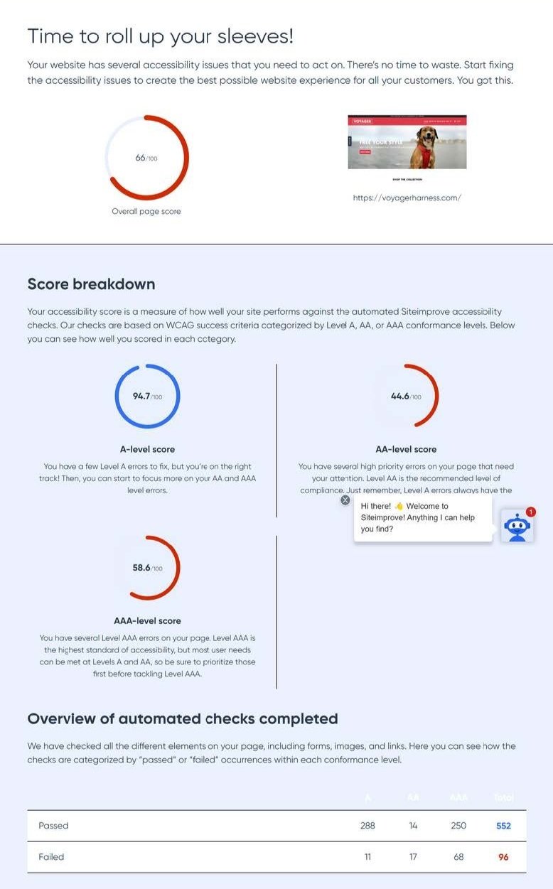
Once we determined our customer segmentation, we did a usability audit on both platforms. We found the two pain points were:
No clear user experience and ineffective purchase flows.
The size of the harnesses and charts were not clear to the customer.
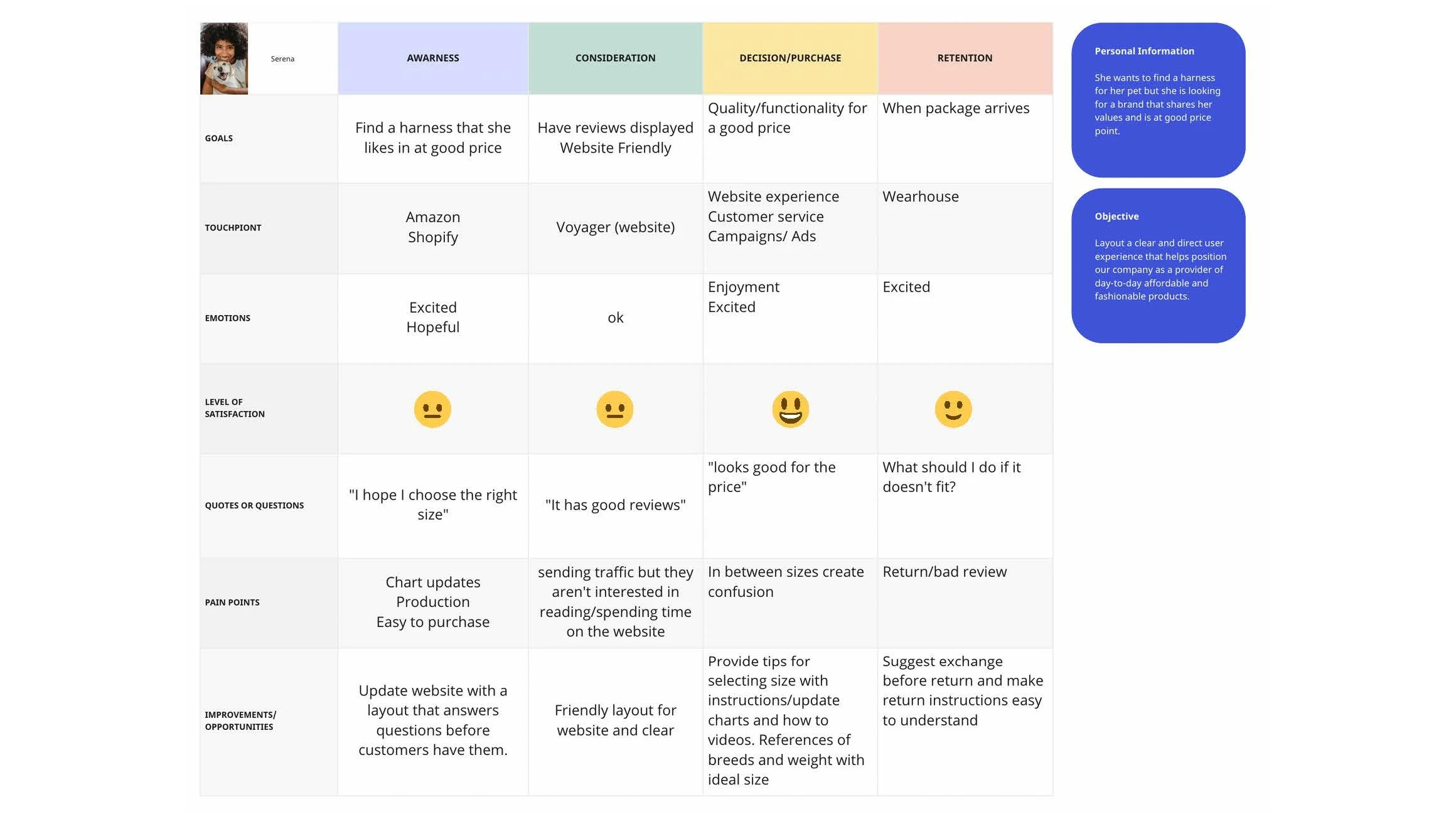
Customer Journey
“Who are we designing (for)/
talking/selling (to)?”
By understanding the expectations, concerns, and motivations of target users, it’s possible to design the product that will satisfy users’ needs and therefore be successful.
Ideation
Once we defined the problem, we started the ideation process. We brainstormed ideas that could improve the experiences of our customers on Amazon and Shopify, focusing on shared pain points as well as challenges unique to each platform. I worked together with the business and product teams, gathering their feedback to help validate our conclusions.
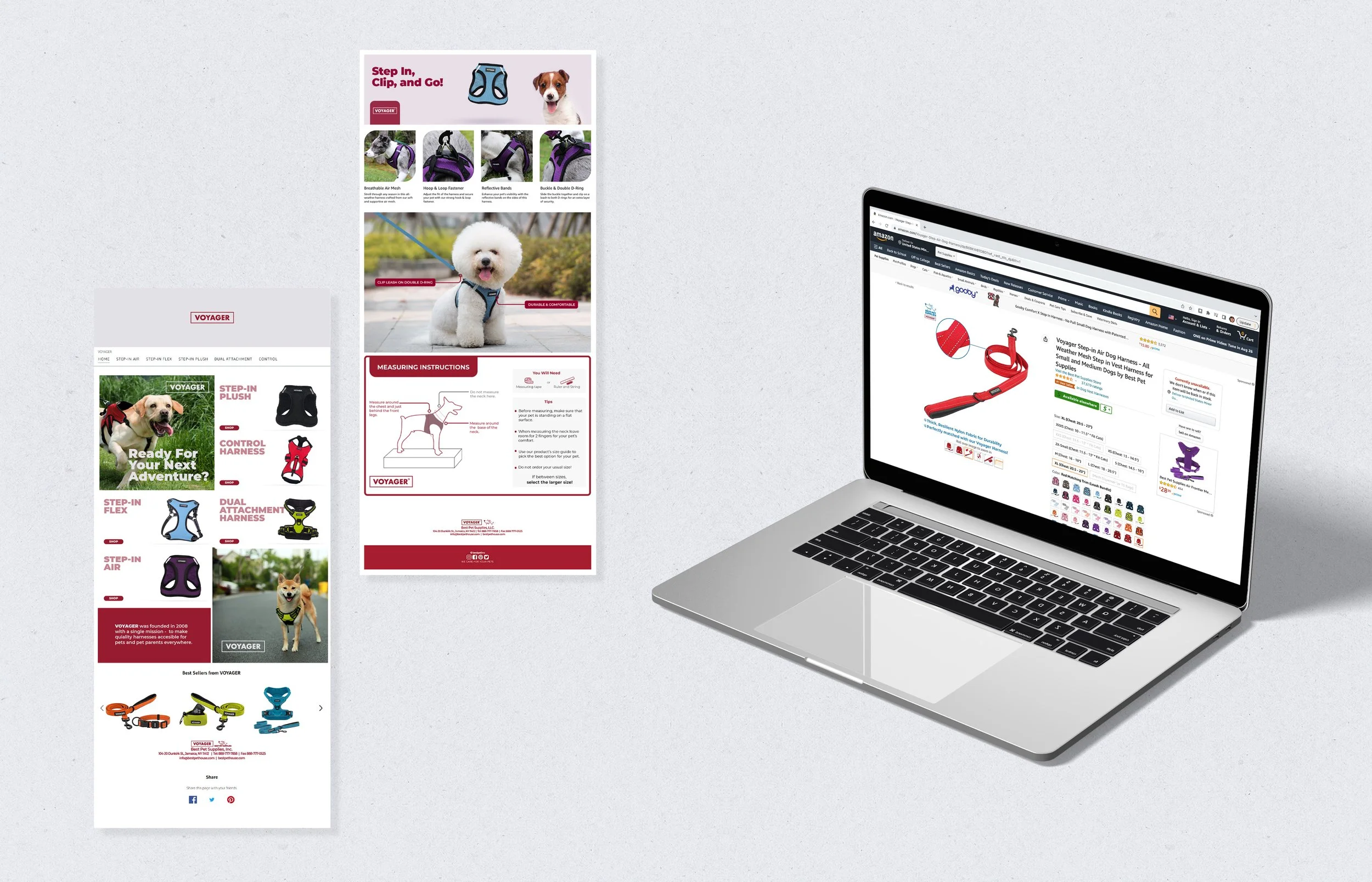
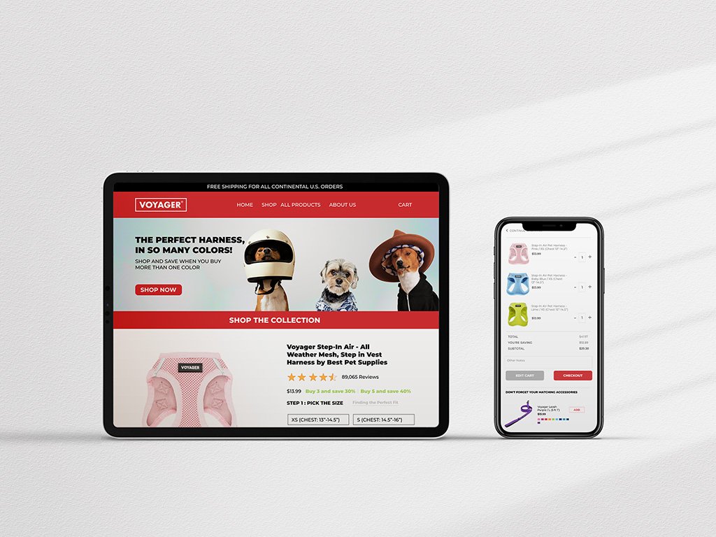
High Fidelity Prototype
We combined the brand styles in the wireframes to be consistent, added interactions to enhance the user experience, and created the final product we used for A/B testing.
Results
The rebranding and redesign efforts were a success. Sales growth increased as a result of targeted marketing efforts and a better customer experience. The redesigned website received positive customer feedback, leading to increased customer satisfaction. The decline in returned products also led to cost savings for the company.
Test outcomes
Having A/B testing on Shopify helped us understand what was and was not working in our existing flows. We noticed that users enjoyed having video content, reviews, and how-to content on the site. We were able to apply these learnings to both Shopify and the Amazon storefront, driving increased traffic and sales.
key learnings
Knowing your target audience drives your design decisions and priorities.
1
Adding extra information where we know the customer normally struggles is being one step ahead in their journey and will give satisfaction to our customer.
2
We can optimize our user experience and interfaces to minimize friction for our target customers. For example, adding a specific section for a video of how-to-measure your dog prior to choosing the harness size. After adding, we saw a reduction in both product returns and reduced negative reviews based on inaccurate sizing.
3
Having full documentation helps us share the information with other stakeholders and make it easier for them to support the decision making.
4
Conclusion
The rebranding and redesign of Voyager was a crucial step in the company's growth. By understanding the target market and customers, tailoring marketing efforts, and optimizing the customer journey, the company was able to increase sales growth and customer satisfaction. This case study demonstrates the importance of considering both branding and user experience in driving business success.
Next steps
Speak with the marketing team to plan new campaigns to target our ideal customers with the research in mind.
Based on identified customer pain points, update all the sizing charts to provide a better user experience.
Complete redesign of Shopify website to reflect market and user research.
Iterate on an initial redesign with A/B testing and user interviews.